
A production engineer opens the morning report and sees that an oil well produced less this month than it did last month. Is the well failing, responding normally to reservoir depletion, or being limited by a surface problem? The production decline curve is often the first place to look.
At its simplest, a decline curve turns a long list of daily or monthly volumes into a picture of how a well’s rate changes over time. It helps teams estimate future production, recognize unusual behavior, and make more disciplined operating decisions.
But a downward-sloping line is not automatically a reservoir forecast. It may also reflect shut-ins, changing choke settings, flowing-pressure changes, water handling limits, or errors in the data. Reading the curve well means connecting the shape to the well’s actual operating history.
This guide builds the foundation for reading a basic oil-well production decline curve, then shows where the method is useful, where it can mislead, and what questions should follow the first plot.
📉 What a Production Decline Curve Shows
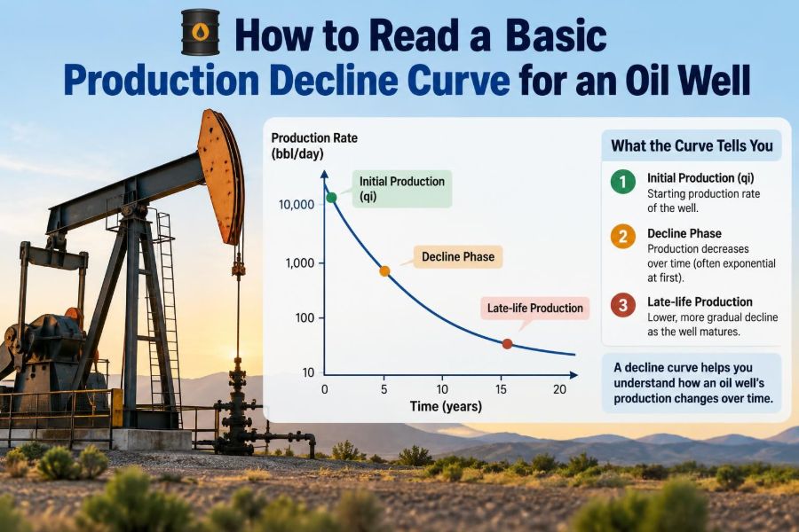
A production decline curve is a graph of production rate or cumulative production against time. For an oil well, the vertical axis commonly shows oil rate, such as barrels of oil per day, while the horizontal axis shows calendar time in days, months, or years.
Most wells produce at their highest sustainable rate early in life and decline afterward. As fluids are withdrawn, pressure support, fluid mobility, and the ease of moving hydrocarbons toward the well can change. A curve makes that broad trend visible.
The curve is descriptive before it is predictive. It tells you what has happened in the recorded data; a forecast requires assumptions about what will continue and why.
🧭 Why Engineers Use Decline Analysis
Decline-curve analysis supports everyday reservoir and production decisions. It is relatively quick, uses routinely collected production data, and can provide a practical estimate of future volumes when the well is in a recognizable decline behavior.
Typical uses include:
- estimating future oil, gas, or water rates;
- calculating expected cumulative production and remaining recoverable volumes;
- screening wells for surveillance or intervention;
- building field-level forecasts from individual well forecasts;
- checking whether actual performance is materially above or below plan.
It does not replace pressure-transient testing, material balance, reservoir simulation, or detailed nodal analysis. Instead, it is one useful layer of evidence in a larger technical picture.
🗂️ Start with the Right Production Data
A polished graph cannot repair poor input data. Before interpreting a decline, confirm the reporting period, units, allocation method, and whether rates represent measured volumes or allocated estimates.
Monthly production is common because it smooths daily noise and aligns with reporting practices. Daily data can reveal operational events more clearly, but it often needs careful treatment because a single shut-in day can make a monthly-equivalent rate appear dramatically low.
At minimum, collect oil volume, gas volume, water volume, producing days, and relevant operating notes. If available, include flowing tubing pressure, wellhead pressure, choke size, artificial-lift status, and workover dates.
🧮 Rate, Volume, and Producing Days
A frequent source of confusion is the difference between a monthly oil volume and an oil production rate. A well that made 3,000 barrels in a 30-day month has an average calendar-day rate of 100 barrels per day. If it flowed for only 15 days, its average producing-day rate is 200 barrels per producing day.
Both figures can be useful, but they answer different questions. Calendar-day rate reflects delivered production over the month. Producing-day rate better indicates what the well did while it was actually online.
When interpreting reservoir decline, separate downtime-driven loss from a fall in the well’s online capability. Otherwise, a maintenance outage can be mistaken for a sudden deterioration in the reservoir.
📊 Choosing the Axes and Scale
The most basic plot uses time on the horizontal axis and oil rate on the vertical axis. A linear scale is intuitive: equal vertical distances represent equal rate changes. It is especially helpful for reviewing operational swings and communicating with non-specialists.
A semilog plot uses a logarithmic vertical rate axis. On this plot, certain decline behaviors can form a straight line, making trends easier to recognize. Because the scale compresses high rates and expands low rates, the reader must always check the axis labels.
A cumulative plot places total produced volume on one axis. It is useful for understanding depletion and checking whether a forecasted ultimate recovery is reasonable, but it does not show short-term rate changes as clearly as a rate-time plot.
⏱️ Calendar Time Versus Flowing Time
Calendar time counts every day since production began. Flowing time counts only days when the well was producing. The difference matters when a well has repeated shut-ins, facility constraints, or long repair periods.
Calendar-time decline is often appropriate for business forecasting because it represents actual delivered volumes. Flowing-time decline can be more revealing for reservoir performance because it reduces the visual effect of non-producing periods.
Neither choice is universally correct. State which time basis is being used, and retain the shutdown history so other readers can understand the curve.
🏁 Recognizing the Early-Life Transient Period
Early production is often the least reliable part of a decline curve for long-range forecasting. Cleanup after drilling or completion, changing choke sizes, fracture-fluid recovery, and rapid pressure redistribution can all create rates that do not represent stable decline behavior.
In unconventional wells, early high rates may fall sharply before a more interpretable trend develops. In conventional wells, initial testing and production restrictions can also distort the apparent peak.
Do not automatically fit a long-term curve through every early data point. First ask whether the well had reached relatively consistent operating conditions and whether the rate history is sufficiently stabilized for the forecast purpose.
📐 The Meaning of Decline Rate
Decline rate describes how quickly production rate decreases. It is commonly expressed as a percentage per year, but the definition needs care. A nominal decline and an effective annual decline are related yet not identical ways of describing a rate reduction.
For a simple annual example, a well falling from 100 to 80 barrels per day over a year has lost 20 barrels per day, or 20% of its starting rate. The appropriate mathematical treatment becomes more important when comparing wells, using monthly data, or converting forecast parameters.
Always record the decline convention used in the forecast. A percentage without its time basis and definition can be misunderstood.
📏 Exponential Decline: A Constant Percentage Fall
Exponential decline assumes that the well loses the same fraction of its rate during each equal time interval. The absolute rate loss becomes smaller as the well gets older: losing 10% of 100 is 10, while losing 10% of 50 is 5.
On a semilog plot of rate versus time, ideal exponential behavior appears as a straight line. This makes the model convenient for mature wells that show a stable fractional decline.
It is not a default rule for every well. Applying exponential decline to a period with changing operations or complex transient flow can create a forecast that appears neat but lacks a defensible physical basis.
📈 Harmonic Decline: A Slower-Tailing Pattern
Harmonic decline is a form of hyperbolic decline with an exponent of one. Its rate decreases rapidly at first and then develops a long tail. Historically, it has sometimes been used because it can generate larger long-term volumes than exponential decline.
That long tail is also its caution. A harmonic forecast can remain optimistic for a very long period if applied without a justified terminal behavior or economic limit.
Use it as a mathematical model, not as a promise that production will persist indefinitely. The well will eventually encounter economic, mechanical, pressure, fluid-handling, or abandonment constraints.
🌀 Hyperbolic Decline: Curved Rather Than Straight
Hyperbolic decline allows the decline rate itself to change over time. It is commonly represented with a hyperbolic exponent, often written as b. When b is between zero and one, the behavior lies between exponential and harmonic forms.
On a semilog plot, a hyperbolic trend is curved rather than straight. This flexibility can describe early or intermediate behavior in many wells, particularly where transient flow effects are influential.
Flexibility is useful, but it can also magnify uncertainty. Small changes to the fitted exponent may create large differences in long-term cumulative production, especially if the forecast extends far beyond the available production history.
🔄 Transitioning to Terminal Decline
A common practical workflow uses a hyperbolic decline for an early period and then transitions to an exponential terminal decline. The transition reflects the idea that an initially changing decline may eventually settle into a more stable mature behavior.
The timing and terminal decline should be based on well performance, analog wells, reservoir understanding, and economic conditions—not merely on a software default. A forecast should document the selected transition criteria.
This approach does not eliminate uncertainty. It makes the assumption visible and prevents an aggressive early-life trend from being extrapolated endlessly.
🧾 A Quick Comparison of Decline Types
| Decline type | Typical visual clue | Main strength | Main caution |
|---|---|---|---|
| Exponential | Straight line on semilog rate-time plot | Simple mature-well forecast | May be too restrictive early in well life |
| Hyperbolic | Curved line on semilog plot | Captures changing decline behavior | Long-term forecast can be highly sensitive |
| Harmonic | Strongly flattening rate decline | Describes a long mathematical tail | Can overstate late-life volumes |
The labels identify equations, not reservoir diagnoses. A good fit is helpful, but a fit alone does not establish the physical mechanism producing the curve.
🔍 Reading the Shape Before Fitting an Equation
Before selecting a model, inspect the raw history. Look for the peak rate, the overall trend, repeated interruptions, long flat periods, abrupt steps, and whether the well is still being actively optimized.
A smooth decline might suggest a relatively stable operating condition. A sawtooth pattern can indicate cycling, intermittent lift, periodic shut-ins, or measurement and allocation issues. A flat plateau may mean a facility or choke is constraining the well rather than the reservoir.
Fitting software can draw a curve through almost any dataset. Engineering judgment begins with asking what created the points.
🚫 Separating Downtime from True Reservoir Decline
Suppose a well normally produces 120 barrels per day but is shut in for ten days during a 30-day month. Its calendar-month average will be about 80 barrels per day even if its rate while online did not change. A trend based only on calendar-day averages may show a false decline.
Flag shut-ins, curtailments, and facility outages. Depending on the objective, analysts may exclude affected points, normalize them to producing days, or retain them in a separate calendar-time business forecast.
Do not silently remove inconvenient data. The key is traceability: a reader should be able to see what was changed, why it was changed, and how the choice affects the result.
🎛️ Chokes, Pressures, and Surface Constraints
A well’s rate is controlled by the entire production system, not just the reservoir. A smaller choke, higher separator pressure, restricted flowline, compressor limitation, or water disposal bottleneck can reduce the recorded oil rate.
These effects can mimic decline. For example, if a choke change reduces drawdown, the rate may step down immediately even though the reservoir’s underlying deliverability has not changed by the same amount.
Review operating records alongside the curve. When a rate step coincides with a documented pressure or choke change, treat it as an operational event first and a reservoir signal second.
💧 Water Production and Water Cut
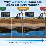
Water cut is the fraction of liquid production that is water. Rising water cut often reduces oil rate, but the interpretation depends on the reservoir and completion. It may reflect water encroachment, coning, channeling, breakthrough from an injected fluid, or changing relative permeability near the well.
Plot oil rate, water rate, and water cut together when possible. An oil decline paired with rapidly increasing water production tells a different story from an oil decline with stable water behavior.
Water does not automatically mean a well should be shut in. The practical question is whether the well can handle and dispose of water safely and economically while continuing to produce worthwhile oil volumes.
🔥 Gas Behavior Adds Essential Context
Gas-oil ratio, often abbreviated GOR, is the produced gas volume relative to oil volume under stated reporting conditions. A changing GOR can provide clues about fluid behavior, gas liberation, gas breakthrough, lift-gas effects, or allocation uncertainty.
An increasing oil rate accompanied by a sharp GOR increase is not necessarily a pure productivity improvement. Likewise, a falling oil rate with changing gas behavior may point to evolving flow conditions rather than a simple, uniform depletion trend.
Interpret gas data carefully where commingled production, gas lift, or allocation methods complicate the reported values.
⚙️ Artificial Lift Can Reshape the Curve
Many wells eventually need artificial lift to move fluids to surface. Rod pumping, electrical submersible pumps, gas lift, and other systems can materially alter observed production rates.
A pump replacement, changed pump speed, altered gas-lift injection rate, or gas interference can create rate changes that look like reservoir behavior on a chart. A failed lift system can make a productive well appear depleted overnight.
For this reason, decline analysis should include artificial-lift events and operating conditions. The curve is a history of the well system, not a direct pressure gauge for the reservoir.
🛠️ Workovers, Stimulations, and Rate Resets
Workovers and stimulation treatments can reset the production trend. Reperforating, scale removal, acidizing, hydraulic fracturing, or repairing a completion restriction may increase the rate and create a new decline segment.
Do not force one smooth curve through pre- and post-intervention data if the well’s deliverability has clearly changed. Analyze the periods separately, then document the event and its observed impact.
A post-workover uplift should also be evaluated over enough time to distinguish a durable improvement from short-lived cleanup or transient effects.
🧠 The Role of Reservoir Drive Mechanisms
Reservoir drive describes the energy that moves fluids toward producing wells. Solution-gas drive, water drive, gas-cap expansion, and fluid or rock expansion can lead to different pressure and production responses.
A strong aquifer may help sustain pressure but can bring increasing water production. A depletion-driven system may experience falling pressure and changing gas behavior. These are broad concepts, not one-to-one signatures that can be diagnosed from a decline curve alone.
Use reservoir knowledge to test whether the fitted decline is plausible. A mathematically smooth forecast that conflicts with known pressure support or fluid movement deserves closer review.
🧪 A Hypothetical Reading Exercise
Imagine a well that begins at 250 barrels of oil per day, falls to 150 over several months, then declines more gradually. During the first month, the well was cleaned up and its choke was adjusted twice. Later records show stable choke settings and consistent producing days.
The early steep fall may not be suitable for a long-term fit because cleanup and changing operating conditions influenced it. An analyst might identify a later stable period, test a hyperbolic fit, compare it with analog wells, and set a justified transition to terminal exponential decline.
Now add a three-month water-handling restriction that cuts rate despite unchanged downhole conditions. Those months should be flagged rather than blindly treated as evidence that the reservoir decline accelerated.
🧷 How to Fit a Basic Decline Curve
A basic workflow is intentionally simple, but every step should be reviewable:
- Compile production volumes, producing days, and operating events on a consistent time basis.
- Plot oil rate versus time before filtering or fitting anything.
- Identify startup, downtime, curtailment, interventions, and obvious data-quality issues.
- Select a representative decline segment with reasonably stable conditions.
- Test an appropriate functional form and inspect the residuals, not just the visual match.
- Forecast only to a defined economic, contractual, mechanical, or technical limit.
- Compare the result with pressure, water, gas, and analog-well evidence.
Software accelerates the calculations, but it cannot decide which points represent comparable operating conditions. That decision remains an engineering interpretation.
🧩 Use Cumulative Production as a Reality Check
Cumulative oil production is the total oil produced to date. When a rate forecast is integrated over time, it adds future cumulative production and leads toward an estimated ultimate recovery, often called EUR in forecasting discussions.
Check whether the implied cumulative volume is reasonable relative to well spacing, reservoir thickness, drainage assumptions, pressure behavior, recovery mechanism, and comparable wells. This is not a way to force every well to match an average; it is a way to notice forecasts that are out of scale with the broader evidence.
A decline curve can fit historical rates extremely well while still implying an unrealistic long-term cumulative volume.
💰 Economic Limit Is Not the Same as Zero Rate
Production forecasts should not usually extend until the mathematical rate reaches zero. Wells are commonly abandoned or suspended when revenue no longer covers operating costs, required repairs, water disposal, compression, emissions compliance, or other obligations.
The economic limit depends on local costs, fluid volumes, product pricing assumptions, facility arrangements, and operating strategy. It can change over the life of a well.
For planning, separate the physical forecast from the economic decision. A well may technically still produce hydrocarbons after it is no longer practical to operate.
⚠️ Common Mistakes When Reading Declines
Several errors recur because they produce tidy but misleading answers:
- Fitting all data blindly: startup and downtime points can dominate the result.
- Ignoring producing days: outages become false reservoir decline.
- Projecting hyperbolic behavior forever: a long mathematical tail can inflate future volumes.
- Using one fluid stream alone: oil, water, gas, and operating pressures often need to be read together.
- Confusing a historical match with a reliable forecast: past data may not contain the next operational change.
- Hiding assumptions: readers cannot evaluate an unexplained cutoff, exclusion, or terminal decline.
The remedy is not complexity for its own sake. It is a transparent workflow that connects the curve to physical and operational context.
🧑💼 Questions to Ask During a Review
A productive review meeting focuses on questions that can change the interpretation. Ask whether the well was online for the reported period, whether surface constraints changed, whether the artificial-lift system was stable, and whether water or gas behavior shifted.
Then ask whether the selected history represents the same producing condition as the forecast period. If the answer is no, the curve may still be useful, but it needs scenario treatment rather than a single deterministic extrapolation.
Finally, ask what evidence would disprove the forecast. That question encourages surveillance planning instead of treating the forecast as a finished answer.
📚 Decline Curves Work Best with Other Evidence
Production decline analysis becomes more reliable when it is compared with other information. Pressure measurements, well tests, completion details, interference observations, geological interpretation, facility constraints, and analog-well performance can all strengthen or challenge the story told by the rate history.
For a mature, stable well, the production record may carry substantial practical value. For a newly completed well, a well after major stimulation, or a reservoir under active injection changes, uncertainty is usually greater and cross-checking is especially valuable.
Think of the curve as a dashboard instrument: useful, responsive, and incomplete on its own.
🗣️ Communicating Uncertainty Clearly
A single forecast line can create false confidence. Where decisions are sensitive to future production, present a base case with clearly stated assumptions and, where appropriate, lower and higher cases that reflect plausible differences in decline behavior, uptime, constraints, or economic limit.
Explain the reason for each case. A lower case might include more conservative terminal behavior or higher expected downtime; an upper case might assume successful debottlenecking. Avoid treating a range as a prediction of every possible outcome.
Clear uncertainty communication helps operations, reserves, commercial, and management teams understand what can be acted on now and what needs more data.
🧭 The Core Principle: Read the Well, Not Just the Line
A basic decline curve begins with rate versus time, but a sound interpretation includes producing days, fluid behavior, pressures, artificial lift, surface constraints, interventions, and reservoir context. The line summarizes performance; it does not explain it by itself.
Use exponential, hyperbolic, and harmonic models as disciplined tools with visible assumptions. Choose the data window deliberately, set a realistic endpoint, and revisit the forecast as new production arrives.
The most useful decline analysis is not the one with the smoothest curve. It is the one that makes the clearest, most testable connection between observed production and the conditions that created it.
Read a decline curve as an evolving engineering story, then test that story against the well’s operations and reservoir evidence. 🛢️📉🔧